厚生労働省の委託事業「はたらくカタチ研究島」は
淡路島での雇用と移住を生み出すプロジェクト。
雇用を生み出す機会としての事業の立ち上げで
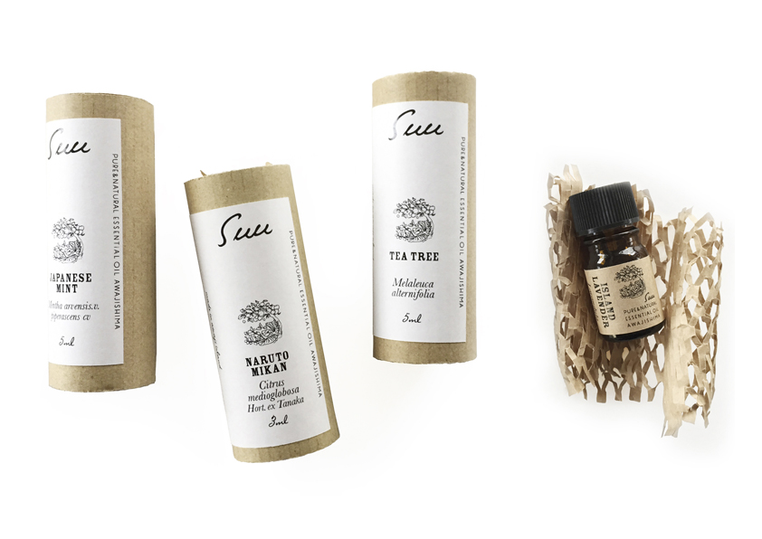
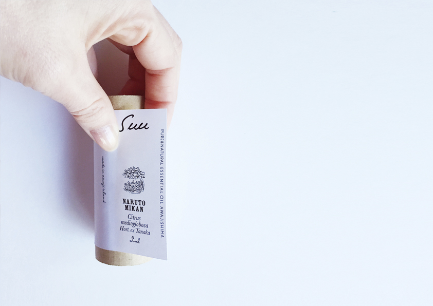
エッセンシャルオイルのリブランドを担当した。
ネーミング、キャッチフレーズ、パッケージの構造から設計。
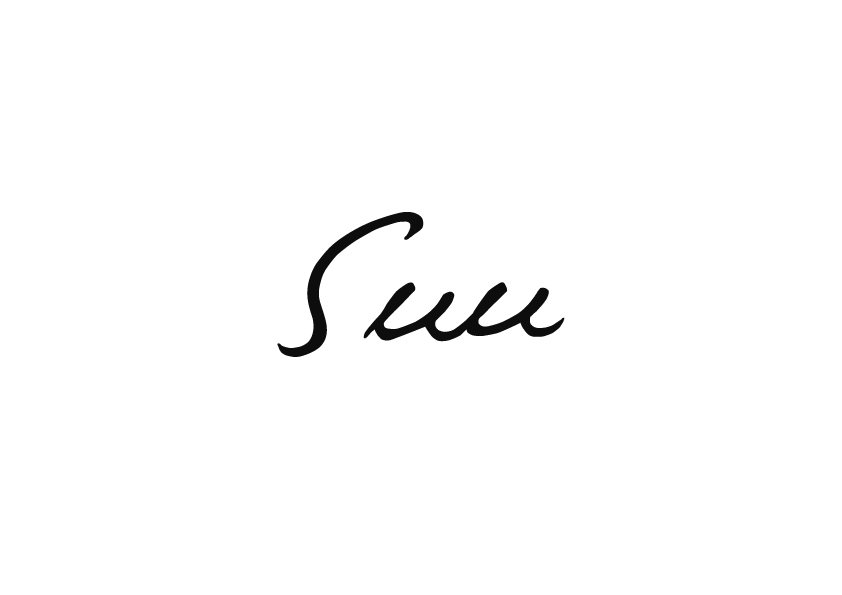
ネーミングは素朴な商品の特長から
「素」や呼吸の「吸う」から名付け、
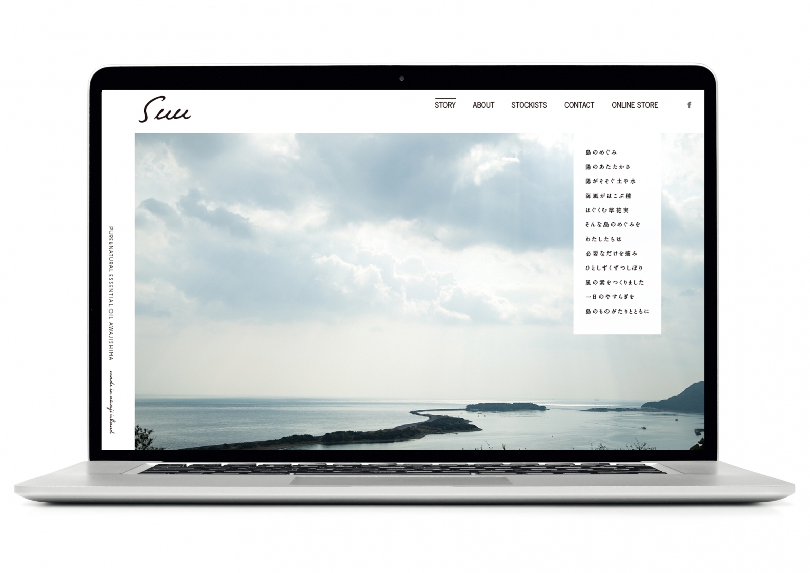
identityは、風の強い淡路島を想起させるために
風になびいた躍動感を表現。
Branding of essential oils and processed products “Suu”
“Working Shape Research Island” commissioned by the Ministry of Health, Labor and Welfare. A project to create employment and migration on Awaji Island. I was in charge of rebranding essential oils in launching a business as an opportunity to create jobs. I designed from the naming, tagline and package structure. The name comes from the simple kanji “su” and how to read the word “suck: su” in breathing. And identity designed the image of Awaji Island where the wind is strong, and designed the dynamic feeling that fluttered in the wind.